SPSS I
Getting Started with SPSS
After attending this training session, you will be able to:
- Open SPSS software and open an existing data set
- Understand the layout of data in data view and in variable view
- Obtain descriptive statistics and frequency tables
- Transform a variable using recode, compute, and visual binning
- Create and edit graphs
- Print, save, and export output
SPSS I: Getting Started with SPSS
Introduction
Code and Dataset
For this training session, please download the following data:
What is SPSS?
SPSS is a statistics program that is intuitive and easy to use. Originally, SPSS was an acronym for “Statistical Package for the Social Sciences,” but now the name just stands on its own. You can do most of your work simply by pointing and clicking with the mouse. There is also an option to work using syntax. The program offers help for most of the tasks you might want to perform. SPSS allows you to do three basic things:
- Store and organize data
- Manipulate data
- Analyze data using statistical procedures
Starting SPSS
You can open SPSS before loading a dataset, as explained below, or you can open SPSS by double-clicking an SPSS file.
To launch SPSS, click on the Start button in the lower left-hand corner of the screen and start typing SPSS. Select IBM SPSS Statistics.
You can open SPSS before loading a dataset, as explained below, or you can open SPSS by double-clicking an SPSS file.
To launch SPSS, click on the Start button in the lower left-hand corner of the screen and start typing SPSS. Select IBM SPSS Statistics.
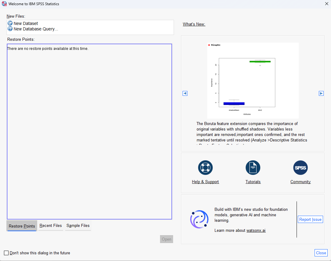
Once the program launches, you will see the following dialog box:
Loading Data
- In the opening SPSS window, double-click New Dataset to open an empty dataset.
- In the File menu in the top-left corner of the window, click Open > Data.
- Select the location where the data file is stored. Click the name of the data file, then click Open.
- In the opening SPSS window, double-click New Dataset to open an empty dataset.
- In the File menu in the top-left corner of the window, click Open > Data.
- Select the location where the data file is stored. Click the name of the data file, then click Open.
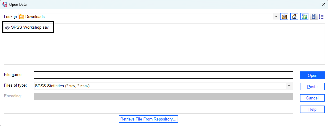
If you are unable to locate your data file, the file is likely not in an SPSS format. SPSS data files usually end in the suffix .sav. By default, SPSS looks for an SPSS formated data set first, but SPSS is also able to read other types of formats. To view data in a different format, change Files of type: to All files (*.*), and the file should appear. Double-click on the file, and SPSS will open it, if it is compatible with SPSS. If you are unable to locate your data file, the file is likely not in an SPSS format. SPSS data files usually end in the suffix .sav. By default, SPSS looks for an SPSS formated data set first, but SPSS is also able to read other types of formats. To view data in a different format, change Files of type: to All files (*.*), and the file should appear. Double-click on the file, and SPSS will open it, if it is compatible with SPSS.
Changing the extension of a file to .sav does not convert the data file into an SPSS formatted data file. It must be imported through SPSS or another program for SPSS to be able to read it.
Title Bar

SPSS has a Title Bar running across the top of each window. The Title Bar includes the title of the window you are in (Data Editor, Output Viewer, etc.) and the name of the file you are working with.
The SPSS Environment
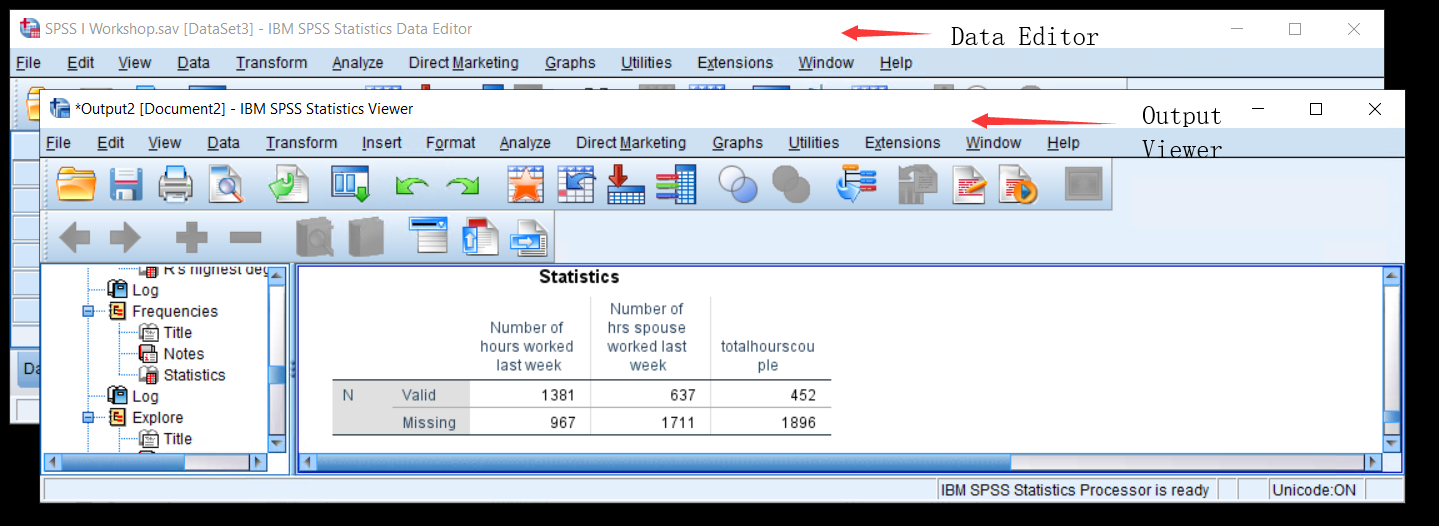
Like many other programs, SPSS uses a variety of windows to accomplish its functions. The two main windows are the Data Editor and the Output Viewer.
Options
Before you begin to explore the SPSS environment, there are some program options that should be specified. Changing these settings does not change the underlying data file in any way. The first option controls how the variables are displayed when you manipulate data or run analysis.
- In the Menu bar, select Edit > Options.
- In the General tab, under Variable Lists, select Display Names and Alphabetical. Click on OK.
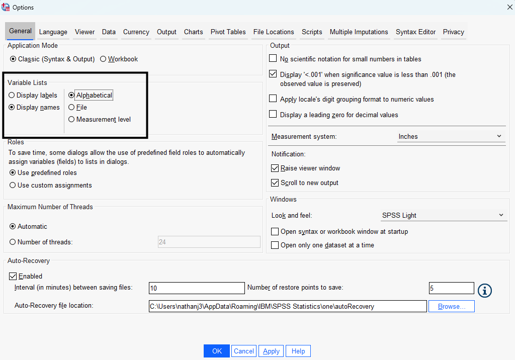
Changing the variable lists to alphabetical will only change how the variables are listed in the dialog boxes. It will not change how they are listed in the data file.
Data Editor
When starting SPSS, the Data Editor is the first window to appear. In the Data Editor, there are two types of views: the Data View and the Variable View.
Data View
The Data View is a spreadsheet that displays data. The Data View is divided into many individual boxes (i.e., cells), and these cells are arranged into rows and columns. Each row is labeled with a number, and each column is labeled with a variable name. In an SPSS data file, each row displays a case. A case may be an individual person, a single country, or any other unit of analysis for which data has been collected. Each column contains a particular variable. Imagine, for example, that the data comes from a poll or survey. Each row represents an individual person who participated in that poll, and each column represents the answer to a question that was asked of that person. This row-by-column arrangement provides a very compact and efficient way to organize data.
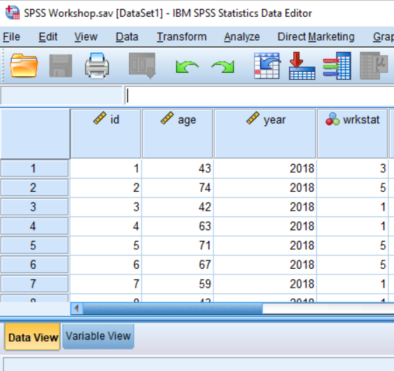
Each variable has both a variable name and variable label. In the Data View, the variable name is at the top of the column. In this example the variable names are id, age, year, and wrkstat. While case numbers are quite intuitive, variable names can be confusing if you are using a preexisting data set. For example, what is the variable wrkstat? To see the variable label, hover the mouse over the variable name, and the variable label will appear in light yellow. SPSS variable names can have a length of up to 64 characters, cannot contain spaces, and must start with a letter. In contrast, variable labels may be up to 255 characters long, may include spaces, and may begin with a number.
SPSS summarizes all of the variable information in Variable View.
Variable View
There are two ways to switch to the Variable View: double-click on any variable name at the top of a column in the Data View; or click on the Variable View tab in the lower left-hand corner of the screen.
The Variable View displays variable attributes including formatting, labeling, and coding. Each row provides information about a variable and information is arranged so each row represents one of the variables in your data set. The column headings indicate what information can be found for your variables. Notice in this view both the variable name and the variable label are displayed.
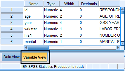
One of the most important elements presented in the Variable View is value labels. Value labels allow users to utilize numeric coding for string variables.
To view or edit a variable’s value labels:
- Click on the cell in the column marked Values.
- A small blue box will appear in the right side of the cell. Click on the blue box to open the Value Labels dialog box. For the variable wrkstat, a “1” indicates a respondent who works full-time. A “2” represents a part-time worker. Use this procedure any time you are confused about how a variable is coded.
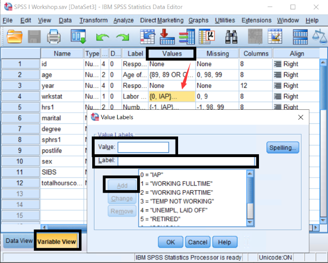
- Value labels can be altered or added in the Value Labels dialog box. When adding a label, specify the value and its label and click Add.
To change an existing label for a certain value, click on the value from the list, and edit the label. Once done, be sure to click Change. Otherwise, your changes will not be saved. Value labels may be removed by highlighting the value label and clicking Remove. To finish, click the OK button.
Dialog Boxes
Dialog boxes are the main way to interact with SPSS. The window that appeared when changing values labels is referred to as a dialog box. Choosing commands will usually open a dialog box. By default, dialog boxes present a number of options for each command to tailor or customize the output to your specifications.
The features of dialog boxes vary widely, but most of the dialog boxes that you will use share several important elements. Usually, they will allow you to select variables. Depending on the options specified for the appearance of variable lists, the variables in the dialog box will appear with the variable label first, followed by the variable name. However, if the options have been changed to “Display Names,” the dialog box will list only variable names. Most dialog boxes have buttons that say Continue or OK. These buttons are used to run SPSS procedures when you have finished selecting your options. The Cancel button closes the dialog box without running any procedures. The Help button provides specific, on-screen help from the SPSS program. The Paste button turns your current command and the options and variables you have selected into syntax and pastes it into a Syntax window.
Data View: Value Labels Shortcut
Toolbar

The Toolbar contains a row of buttons, and each button is labeled with a small picture, or icon. The Toolbar makes some of the more common commands available without having to navigate through the menus. To find out the function of a particular icon, let the mouse hover over it without clicking it. SPSS will display a small label indicating what function the button performs.
To view value labels in the Data View, click on the  View Value Labels icon in the Toolbar. When this option is selected, SPSS displays value labels instead of numeric values in the data spreadsheet. Before clicking this icon, the data editor presents only numerical values of each variable regardless of the level of measurement. To view value labels in the Data View, click on the View Value Labels icon in the Toolbar. When this option is selected, SPSS displays value labels instead of numeric values in the data spreadsheet. Before clicking this icon, the data editor presents only numerical values of each variable regardless of the level of measurement.
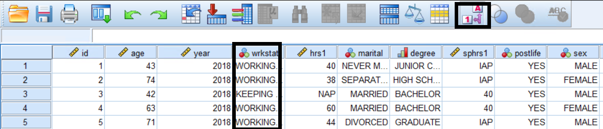
If the full label is not displayed because it does not fit in the designated cell width, this can be changed by grabbing the right side of a cell on the variable label with the mouse and stretching the column to the right (to widen) or left (to shorten).
Switching to variable labels does not change how the underlying data is stored. The data will still be stored as numeric values; it only changes how it is displayed.
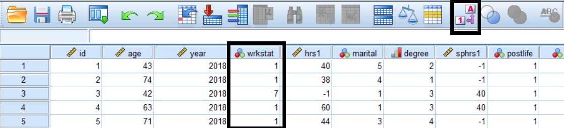
The View Value Labels icon is a toggle button. To go back to displaying numeric data values, click the icon again to deactivate it.
Output Viewer
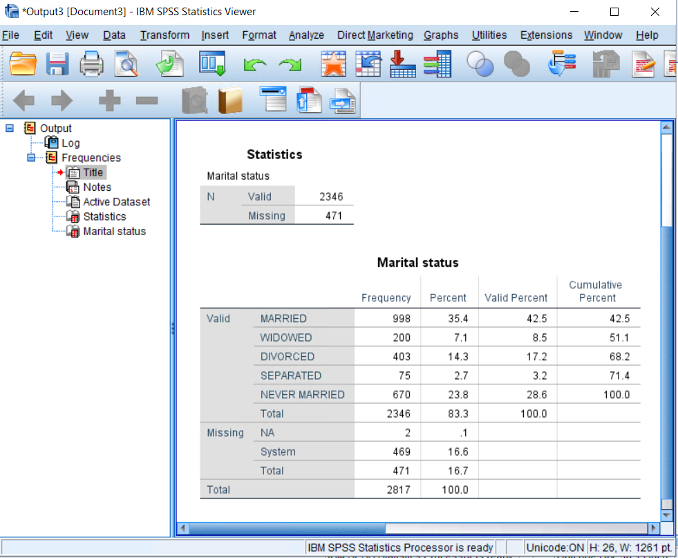
The Output Viewer displays the results of statistical procedures you have run in the current SPSS session. You will not normally see the Output Viewer window until you have run a statistical procedure. A more in-depth discussion of the Output window is located in the frequencies section.
Descriptive Statistics
Directly below the Title bar is the Menu bar. This menu lists most of the commands available in SPSS. For the remainder of the workshop, this Menu bar is where most procedures are found.

Descriptives
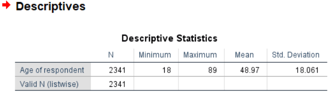
The Descriptives procedure generates a descriptive table summarizing the distribution of a variable. For example, a descriptive table for age (Respondent’s age in years) will show the amount, minimum value, maximum value, mean (average), and standard deviation of cases (respondents). The Descriptives procedure also allows you to select several descriptive statistics, including the sum, measures of dispersion (i.e., variance, range, standard error of the mean), and measures of the distribution (i.e., kurtosis, skewness).
To run a descriptive:
In the Menu bar, select Analyze > Descriptive Statistics > Descriptives.
In the Descriptives dialog box, move the variable, age in this case, from the left pane to the Variable(s) box by double-clicking it or using the arrow button. If you move the wrong variable, double-click it to move it back or use the arrow button.
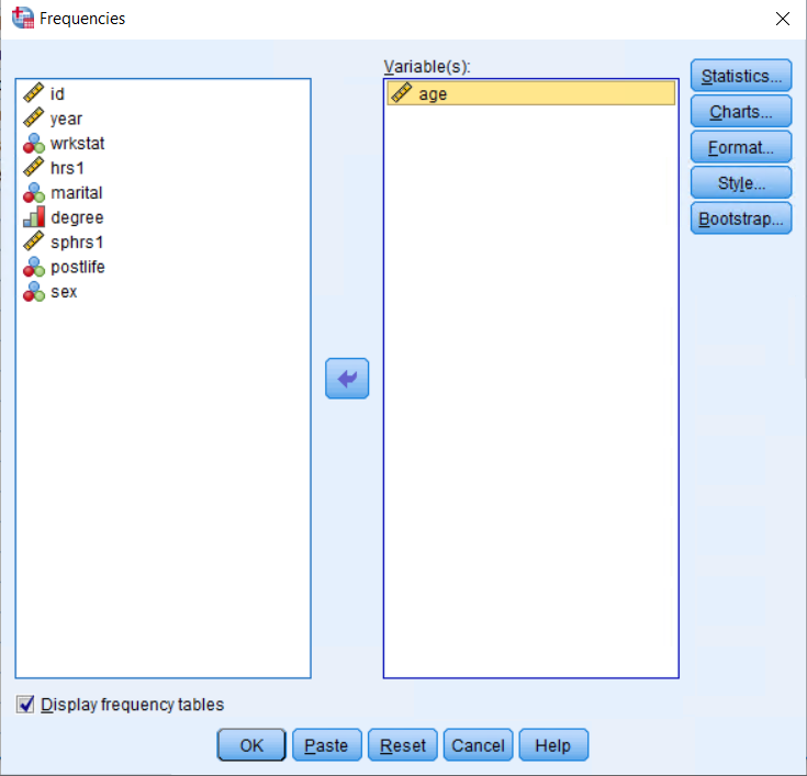
To see the value labels of the variables when choosing variables from the list, right-click on the variable name and select Variable Information. This will display a Variable Information box, with a drop down menu listing the value labels.
- To add optional descriptive measures, click on the Options button, and select the statistics that you want to include. To unselect a statistic, click the checkbox again and it will disappear. When done selecting statistics, click Continue to return to the Descriptives dialog box.
Output Window: Descriptives
After you run a procedure the Output Viewer will automatically appear. The Output Viewer window has two parts: the left displays an outline of the procedures you have run. The right side contains the actual output tables and charts, created by any procedures that have been run. Below is an example of the main output in the right hand side of the Output Viewer.
Frequencies
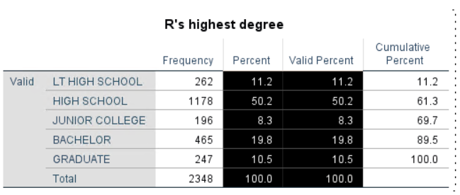
The Frequencies procedure generates a frequency table illustrating how cases are distributed across the values of a variable. For example, a frequency table for degree (Respondent’s highest degree) will show how many respondents have “less than high school”, “high school”, “junior college”, “bachelor”, or “graduate” levels of education. The Frequencies procedure also allows you to select several descriptive statistics, including percentile values, measures of central tendency (i.e., mean), measures of dispersion (i.e., standard deviation), and measures of the distribution (i.e., skewness).
To run a frequency:
In the Menu bar, select Analyze > Descriptive Statistics > Frequencies.
In the Frequencies dialog box, move the variable, degree in this case, from the left pane to the Variable(s) box by double-clicking it or using the arrow button. If you move the wrong variable, double-click it to move it back or use the arrow button.
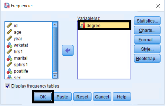
To see the value labels of the variables when choosing variables from the list, right-click on the variable name and select Variable Information. This will display a Variable Information box, with a drop down menu listing the value labels.
To add descriptive statistics, click on the Statistics button, and select the statistics that you want to include. To unselect a statistic, click the checkbox again and it will disappear. When done selecting statistics, click Continue to return to the Frequencies dialog box.
To produce charts (bar, histogram, or pie charts), click on Charts, and select the charts that you want to include. When done selecting charts, click Continue to return to the Frequencies dialog box. Click OK to finish.
Output Window: Frequencies
After you run a procedure the Output Viewer will automatically appear again. Clicking on different sections of the outline, on the left hand side, makes it possible to navigate quickly through the output. To display a particular item in the outline of procedures in the output window, single-click on the item of interest.
You may want to change the labeling of the output so that both variable names and labels are displayed in output tables and graphs:
- In the Menu bar, select Edit > Options.
- In the Output Labels tab, under Pivot Table Labeling, select Names and Labels for each drop down box. Click on OK to activate these changes.
- Rerun the frequency table procedure to see the change in the Output window.
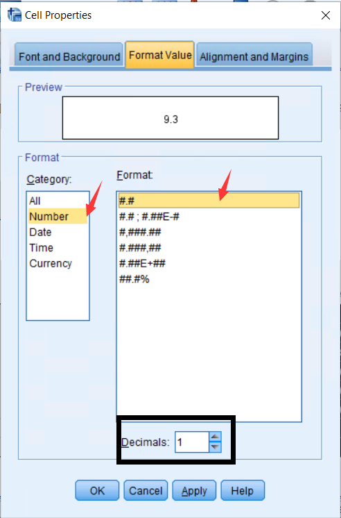
To change the number of decimal places that appears in the output: 1. In the Output Viewer, double-click the pivot table you want to edit, and highlight the cells you want to format.
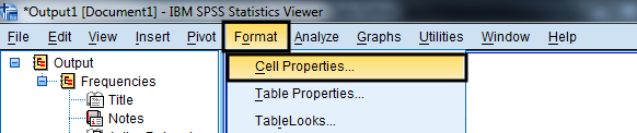
- In the Menu bar, select Format > Cell Properties.
- In the Cell Properties dialog box, select the Format Value tab, edit the number of decimal places, and click OK.
Explore
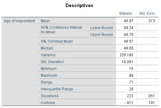
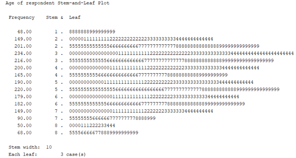
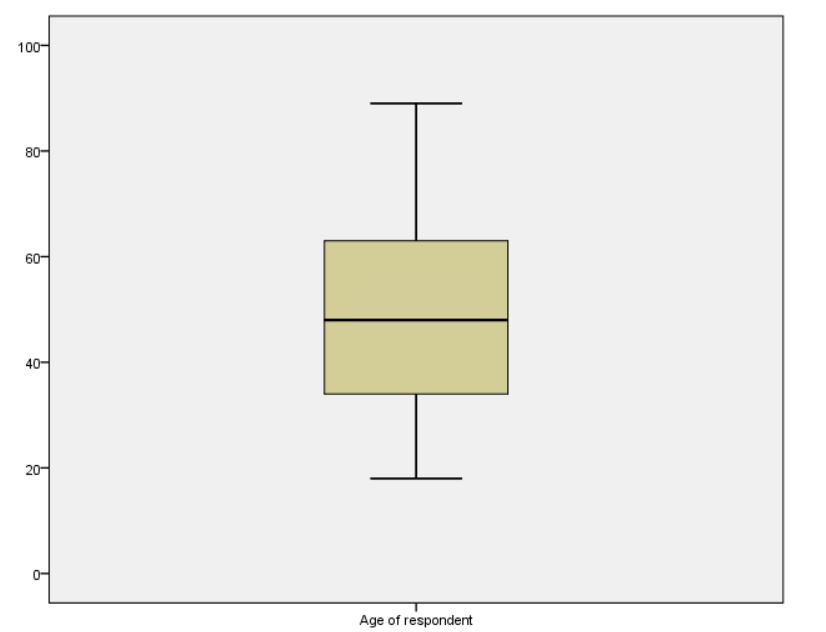
The Frequencies procedure generates output illustrating how cases are distributed across the values of a variable in more depth than {Descriptives} and {Frequencies}. For example, {Explore} for age (Respondent’s age) will provide descriptive statistics, including percentile values, measures of central tendency (i.e., mean), measures of dispersion (i.e., standard deviation), and measures of the distribution (i.e., skewness). {Explore} will also provide stem-and-leaf-plots and boxplots for the selected variable.
An additional useful option of Explore is the ability to describe a continous variable at different levels of a categorical or ordinal (nominal) variable.
To run a frequency:
- In the Menu bar, select Analyze > Descriptive Statistics > Explore.
- In the Frequencies dialog box, move the variable, age in this case, from the left pane to the Variable(s) box by double-clicking it or using the arrow button. If you move the wrong variable, double-click it to move it back or use the arrow button.
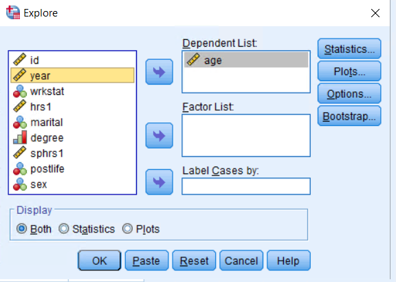
To see the value labels of the variables when choosing variables from the list, right-click on the variable name and select **Variable Information**. This will display a **Variable Information** box, with a drop down menu listing the value labels.- To add descriptive statistics, click on the Statistics button, and select the statistics that you want to include. To unselect a statistic, click the checkbox again and it will disappear. When done selecting statistics, click Continue to return to the Explore dialog box.
- If you wanted to see descriptives of age by different levels of degree, you would additionally move degree into the factor list. Click OK to finish.
Output Window: Frequencies
After you run this procedure the Output Viewer will automatically appear again.
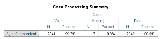
- You will see the Case Processing Summary.
- Followed by the Descriptives.
- New output for Explore will also include a Stem and Leaf Plot.
- Explore will additionally include a Boxplot.
Missing Values in SPSS
Since we are using numeric values, we will have missing values. There are two types of missing values in SPSS: (1) System-missing values and (2) User-missing values.
System-missing values are the values left blank in the data and SPSS automatically treats them as system-missing values. Missing values are displayed as ( . ) in a cell of data view.
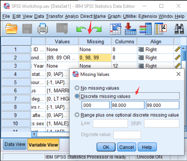
User-missing values are numeric values that are defined as missing values by the user. You can use any numeric values as long as missing values do not overlap with any existing valid values for the variable. For instance, GSS 2018 data uses negative values and a very high number for user-missing, such as “-1” as IAP (inapplicable), “98” as DK (don’t know), and “99” NA (no answer). They can be entered as discrete missing values from the Missing column in Variable View.
Final Tip for Section 4: Moving from One Window to Another
If more than one window is open in SPSS, it is possible to switch back and forth between them from the Menu bar. Click on the Window menu located on the Menu bar, and a list of all currently open windows will appear. The active window (the window currently displayed on the screen) is indicated with a check mark. To activate a different window, click on the name of that window.

Active and Inactive Windows
You can also tell which data window is active from the icon that appears next to the file name in the Title bar. Active data sets will have a red plus sign next to the file name. This icon will not appear next to inactive data sets. Differentiating between active data sets and inactive datas sets will be particularly important later on when you work with multiple data sets and begin merging sets together.


Exercise 1
Run frequencies for the variable sibs (number of brothers and sisters).
- What is the total number of cases?
- What is the number of valid and missing cases?
- What are the mean, median, mode, range, and standard deviation of this variable?
(See Appendix A for answers.)
Data Transformation
There are several ways to transform a variable: recoding, computing, and visual binning.
Recoding Variables
The Recode procedure changes, rearranges, or consolidates the values of an existing variable. If you have a variable with multiple categories (e.g., The variable wrkstat, which represents the respondent’s labor force status, has the 8 categories listed below), you might want to reduce the number of categories to a more manageable number. For example, you can regroup people as “In the labor force” (values 1 through 3), and “Not in the labor force” (values 4 through 8).
The Recode into Different Variables procedure will create a new variable in your data set while leaving the original variable unchanged. Using Recode into Same Variables permanently overwrites the original variable in the data set, instead of making a new variable.
To recode a variable into a different variable:
In the Menu bar, select Transform > Recode into Different Variables.
Move the variable to be recoded from the variable list on the left, in this case wrkstat, to the Numeric Variable box, either by double-clicking it or using the arrow button.
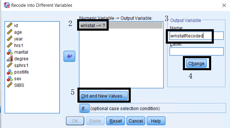
Specify a name for the Output Variable (the new variable that you will be creating) in the Name box located in the upper right part of the dialog box. Remember that SPSS variable names can have a length of up to 64 characters, cannot contain spaces, and must start with a letter. You may also add a label for this new variable in the Label box. Here we are using the name wrkstatRecoded.
Click the Change button after you have entered the name and label.
SPSS will not allow you to continue until you give a new variable a name.
- Click the Old and New Values button, to specify the new values.
The basic idea is to map the new values onto old values – that is, you need to “pair” old and new values. A wide variety of recoding options are available. Each option assigns a new value to a specific old value or values.
Information about the Old Value of the variable is entered on the left side, and the New Value is entered on the right side of the dialog box. Old and new values can be assigned in a number of ways in this dialog box.
For the Old Value:
- Value: The specific old value to be recoded.
- Range (A): All old values in the specified range will be recoded. You may use a specific range, all values from the lowest to a specified value (Lowest through), or a specified value to the highest (through Highest) can be recoded.
- All other values: Refers to all original values not previously specified.
- System-Missing: Refers to system defined missing values only.
- System- or User-Missing: Refers to all system AND user-defined missing values.
For the New Value:
- Value: The new value to be applied.
- System Missing: Used to generate a missing value in the new variable.
- Copy old value: This option is used when you want to copy the values specified in Old Values to the new variable.
Under Old Value, enter a Range of 1 through 3.
Enter a New Value of 1, and click Add.
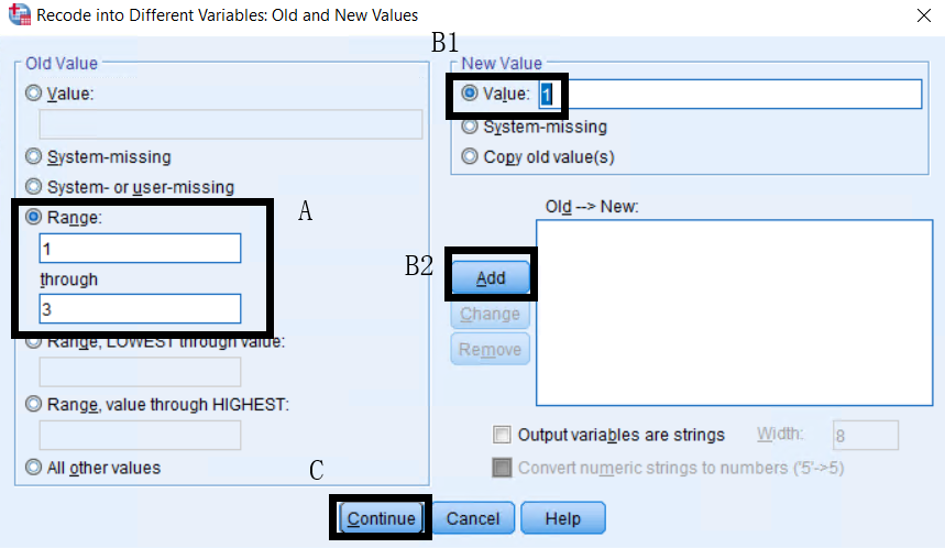
Repeat steps (a) and (b), changing the Range for the Old Value to 4 through 8 and the New Value to 2.
Click Continue to return back to the Recode into Different Variables dialog box.
Now, click OK to finish. The new variable will now appear in your data set.
When you create a new variable, it is always added to the end of the dataset - the new variable will be the furthest to the right in the data view window or at the bottom of the variable view window.
To add value labels to your new variable:
- Return to the Variable View, and highlight the Values cell of the variable wrkstatRecoded.
- Within the Values cells, click the blue button with three dots (
...) to open the Value Labels dialog box. - Enter the labels 1 “In the Labor Force” and 2 “Not in the Labor Force”, and click OK to save your changes.
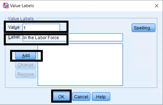
Always verify that your new variable has been coded correctly by running a frequency.
Make a mistake recoding a variable?
If you make a mistake when using the Recode procedure to create a new variable, follow the instructions in this section to perform the recode again. Notice that all of the previous changes are still stored in the system making it easier to fix a variable you have already coded.
Compute
The Compute Variable procedure creates new numeric variables or modifies the values of existing string or numeric variables. This procedure will create a new variable in the data set while leaving the original variable(s) unchanged. For example, you can use Compute to create a new variable: totalHourcouple , indicating number of hours the couple worked last week based on two variables: hrs1 (Number of hours the respondent worked last week) and sphrs1 (Number of hours the respondent’s spouse worked last week).
- In the Menu bar, select Transform > Compute Variable.
- Enter totalHourscouple as the name for the new variable in the Target Variable box.
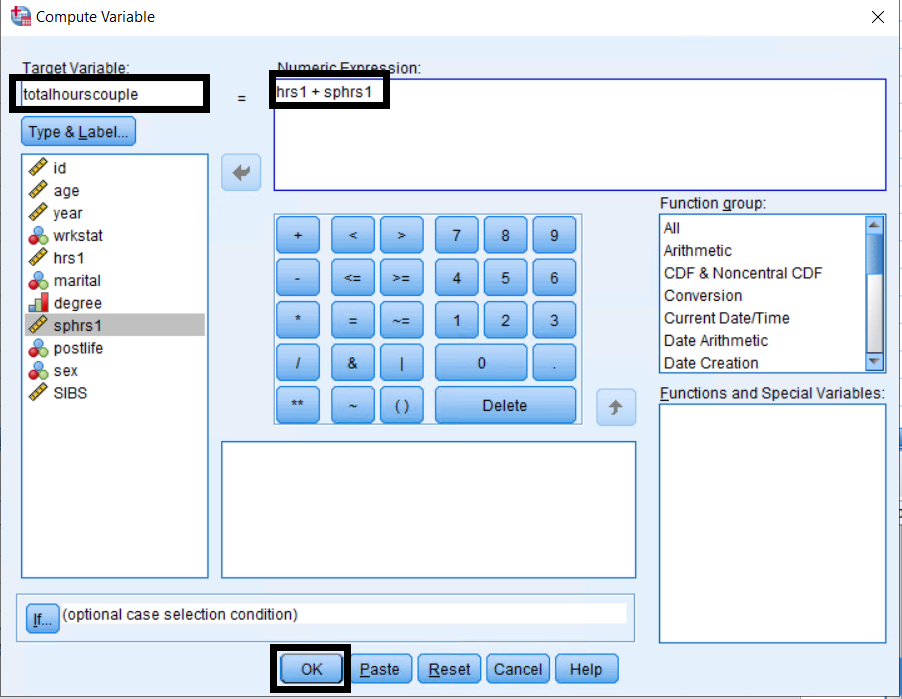
- Click Type and Label to enter a label for the new variable and specify the variable type (numeric or string).
- In the Numeric Expression, specify how the new variable will be computed in the Compute Variable dialog box, either by typing the expression or using the variable lists, functions, and key pad.
In this example, use the expression hrs1 + sphrs1 to generate the totalHourscouple variable.
- Click OK to compute the new variable.
Remember to check to see that the new variable was created in the data editor and run a frequency to verify the information in the variable is correct.
Note on Missing Cases: There are 967 missing cases for the variable hrs1 and 1,711 missing cases for the variable sphrs1 while there are 1,896 missing cases for the new variable, totalHourscouple.
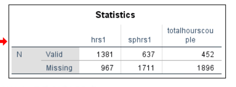
The difference in the number of missing cases occurs because SPSS ignores cases with missing values on any of the component variables when computing a new variable using an arithmetic operator (i.e., + or -). Consequently, all cases with at least one missing value in either variable are given a missing value for new variables. Alternatively, when you use Functions (i.e., Sum(numexpr, numexpr)) instead of an arithmetic operator, SPSS calculates a value for a new variable based on all valid values for the component variables. If a case has only one valid value, that value will be used in the new variable. You can see how this works in Exercise 2.
Exercise 2
To practice the compute and recoding procedures, create a new variable using two different methods. 1. With the Compute Variable procedure, use the sum function Sum(numexpr, numexpr) to create a new variable totalHourscouple_fn, the function sum of hrs1 and sphrs1. 2. Use the Recode into Different Variables procedure to give a value of “0” to cases with a missing value in hrs1 and sphrs1, so that all cases in the data set have a valid value for the new variables. For all other values, specify Copy Old Values. Name these new variables hrsRecode and sphrsRecode, respectively. 3. Use the Compute Variable procedure to create a new variable totalHourscouple_fromRecoded that sums the variables hrsRecode and sphrsRecode using the arithmetic operator (+). 4. Generate frequency tables to compare the new variables.
(See Appendix A for answers.)
Visual Binning
Visual Binning is used to create a categorical variable from a scale variable. Binning refers to taking two or more continuous values and grouping them into the same category. For example, Visual Binning can be used to group a variable with a large number of values, such as the number of hours a respondent worked last week, into two or more categories.
- In the Menu bar, select Transform > Visual Binning.
- Move hrs1 from the Variables list to the Variables to Bin list, and click Continue.
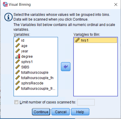
- Click on the variable hrs1 in the Scanned Variable List box. You will now see a bar graph for this variable.
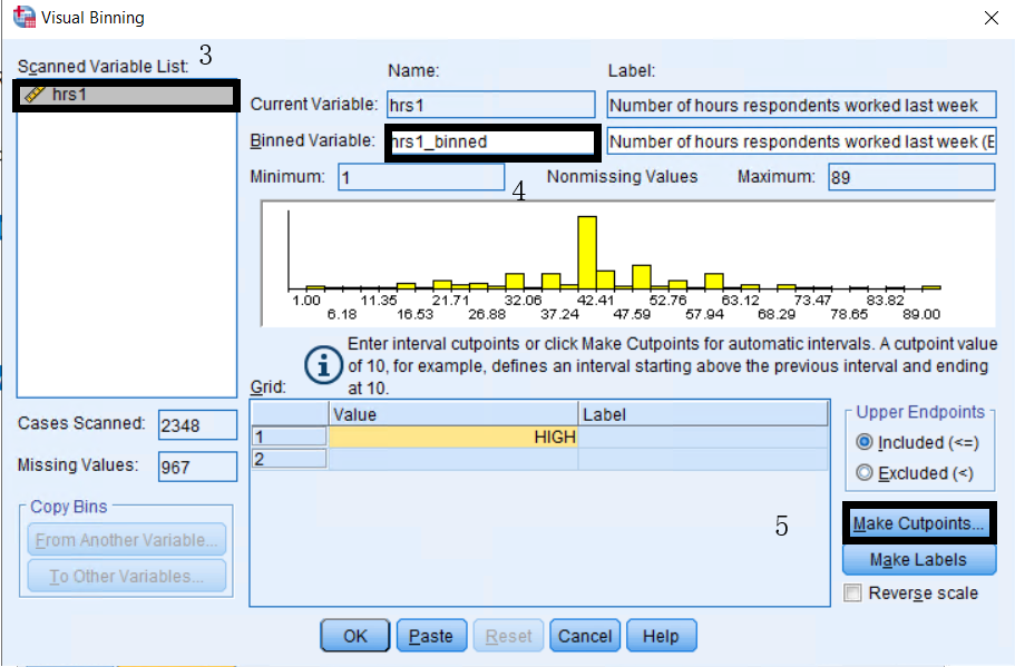
- Type a name for the new variable in the Binned Variable box, here we are using hrs1_binned and edit the variable label if needed.
- Click Make Cutpoints to generate categories automatically.
There are three ways to create cut points automatically: at automatic intervals for equal width intervals, intervals with the same number of cases (SPSS calls this “Equal Percentiles Based on Scanned Cases”), or intervals based on standard deviations. In this case, select Equal width intervals.
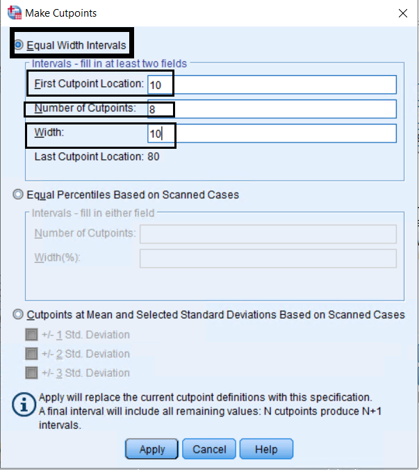
The number of cutpoints is the number of categories minus one. Because we want to create 9 categories in this example (e.g., 9-1 = 8), we will use 8 cutpoints.
In the Make Cutpoints dialog box, enter “10” for the First Cutpoint Location, “8” for the Number of Cutpoints, and “10” for the width. Note that categories can also be created manually by entering interval cutpoints in the Value column.
Click Apply to return to Visual Binning dialog box.
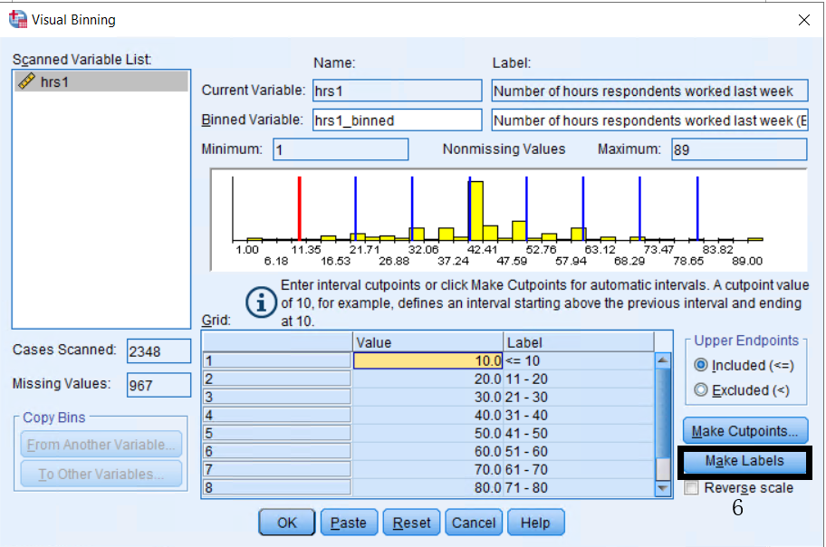
The blue vertical lines in the histogram indicate the locations of the cutpoints that have been created. To automatically generate labels for each category, click on Make Labels. Labels can also be entered manually in the Label column.
Click OK to create the new variable. Remember to confirm that a new variable was generated and check it, using a frequency table.
Note: Visual Binning preserves the missing values of the original variable in the binned variable.
Exercise 3
Using Visual Binning, create a categorical variable, agekdbrn_binned from the scale variable agekdbrn (Respondent’s age when their first child was born). Insert the cutpoints manually to create four categories: “Teens” (13 through 19), “20s” (20 through 29), “30s” (30 through 39), and “40s” (40 through 49). (See Appendix A for answers.)
Multivariate Tables
The Crosstabs procedure produces contingency tables showing the joint distribution of two categorical variables. The frequency distribution of one variable is subdivided according to the values of one variables. The unique combination of values for two variables defines a cell. For example, we will use a crosstab to examine the distribution of the variable postlife (Belief in life after death) by sex:
- In the Menu bar, select Analyze > Descriptive Statistics > Crosstabs.
- Move the dependent variable postlife into Row(s).
- Move the independent variable sex into Column(s).
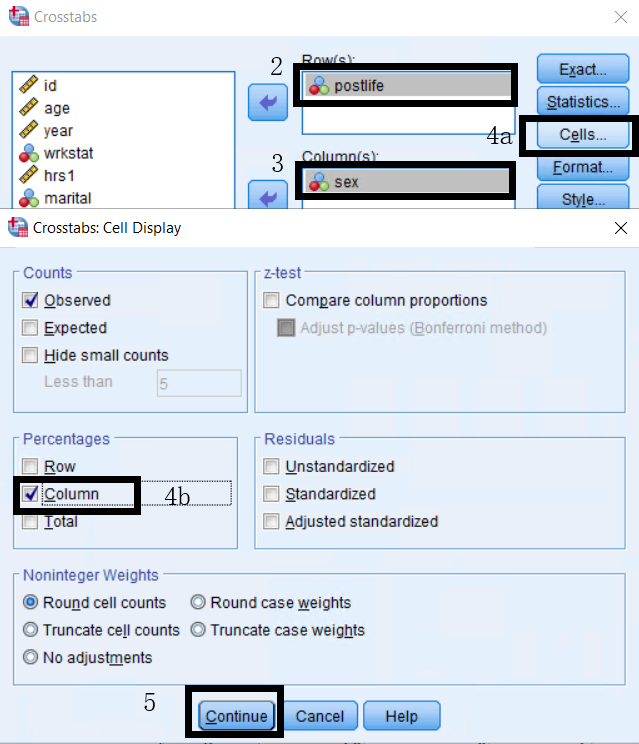
- Click on Cells, and select Column for Percentages.
When selecting whether you want column or row percentages, you will always want whichever contains the independent variable. In this case, our independent variable sex is in the column, so we want column percentages. Therefore, the interpretation would be the percentage of men who believe in life after death or the percentage of women who believe in life after death.
- Click on Continue and OK to finish.
Interpretation of Crosstab Output
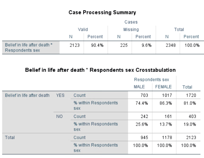
- Number of valid cases: 2,123 cases are included in the crosstabs table.
- Number of missing cases: 225 cases do not have a valid value for at least one of the variables.
- 74.4.
- Combining male and female, 81.0.
Only valid values are included in the Crosstabs table. A case with a missing value for at least one of the variables will be excluded from the table.
Exercise 4
Find out how many foreign-born and native-born survey respondents can speak a language other than English/Spanish. That is, run a crosstab using the variables othlang (Can the respondent speak a language other than English/Spanish?) and born (Was the respondent born in this country?). (See Appendix A for answers.)
Graphics
Creating Charts using Chart Builder
The Chart Builder allows you to build charts from a pre-defined gallery or from individual parts (i.e., axes and bars). Charts are created by dragging and dropping the gallery charts or basic elements onto the Canvas, which is the large area to the right of the Variables list in the Chart Builder dialogue box. As you are building the chart, the canvas displays a preview of the chart.
The measurement level of your variables, whether it is scale, ordinal, or nominal, is very important because the Chart Builder uses this measurement to determine certain defaults while building a chart. Thus, a chart may look different for different measurement levels. A variable’s measurement level can be changed temporarily from within the Chart Builder by right-clicking the variable and choosing a new measurement level.
Chart Builder Layout and Terms
To access the Chart builder, select Graphs > Chart Builder in the Menu Bar.
- Canvas: The canvas is the area of the Chart Builder dialog box where you build the chart.
- Drop Zones: Drop zones are the areas on the canvas to which you drag and drop a variable from the Variables list. As noted previously, the basic drop zone is the axis drop zone. Certain gallery charts (like clustered or stacked bar charts) include grouping drop zones. Additional drop zones may be added from the Groups/Point ID tab. Note that you may only add a variable to a zone when the text in the zone is blue. If the text is black, the zone already contains a variable or statistic.
- Axis Set: An axis set defines one or more axes in a particular coordinate space (like 2-D rectangular or 1-D polar). Adding a gallery item to the canvas automatically creates an axis set. You can also choose one from the Basic Elements tab. Each axis includes an axis drop zone for dragging and dropping variables. Blue text indicates that the zone still requires a variable. Note that every chart requires that you add a variable to the x-axis drop zone.
- Graphic Elements: Graphic elements are the items in the chart that represent data. These are bars, points, lines, and so on.
- Variables List: This list displays the available variables. If a variable selected in this list is categorical, the categories will be listed under the Variables list. This list can also be used to view the variables that make up a multiple response set.
The tabs that appear in the bottom half of the Chart Builder dialog box are used to select the chart type, add grouping variables, and add titles to your chart.
Gallery: The easiest method for building charts is to use the Gallery. Gallery charts automatically set properties and add features to simplify the creation process. Select a category of charts, and drag the picture of the desired chart onto the canvas. If the canvas already displays a chart, the gallery chart replaces the axis set and graphic elements on the chart. Drag variables from the Variables list and drop them into the axis drop zones and, if available, the grouping drop zone.
Basic Elements: Basic elements can be used to build a chart from scratch. Basic elements include axes and graphic elements. To begin building a chart:
- Drag an axis set onto the canvas.
- Add a graphic element type by dragging a graphic element onto the canvas. Not all graphic elements can be used with a particular axis set. Only the relevant graphic elements are enabled.
- Drag variables from the Variables list and drop them into the axis drop zones and, if available, the grouping drop zone. If an axis drop zone already displays a statistic and you want to use that statistic, you do not need to drag a variable into the drop zone.
Groups/Point ID: To include more information in the chart (e.g., clustering or paneling), add a grouping zone to the chart. Click the Groups/Point ID tab and select one or more options. Then drag categorical variables to the new grouping drop zones that appear on the canvas.
Titles/Footnotes: To add titles, subtitles, or footnotes to your chart:
- Click on the Titles/Footnotes tab and select one or more options.
- In the Element Properties dialog box, select the element you have added to the cart and enter the text for the element under Content.
- Once, finished, click Apply to add the element to the chart.
Bar Chart
A bar chart is a graphic representation of numerical values of a categorical variable, which uses rectangles to show a frequency or a proportion of each category in the categorical variable. Spaces are inserted between each rectangle in order to differentiate a bar chart from a histogram. Histograms are graphic representations of continuous variables and as such, have no spaces between each rectangle.
To create a bar chart for marital status, (marital):
- In the Menu Bar, select Graphs > Chart Builder.
- In the Chart Builder, click the Gallery tab and select Bar from the list.
- Drag the Simple Bar icon onto the canvas and the variable marital to the x-axis drop zone.
While the preview uses defined variable labels and measurement levels, it does not display the actual data.
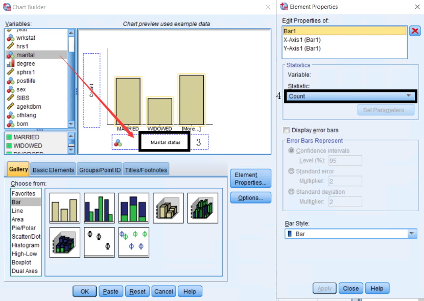
- Specify Count as the statistic in the Element Properties window. This statistic will determine the height of the bars. There may be some chart type limitations. For example, error bar charts can be calculated only for specific statistics.
- To add a title to the chart, click on the Titles/Footnotes tab, select one or more titles and footnotes and use the Element Properties window to edit the title/footnote text.
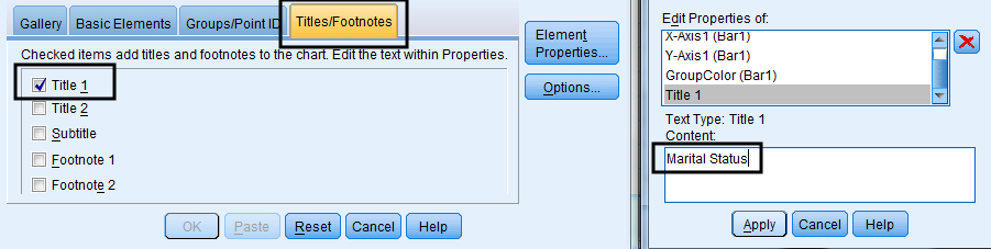
- Select Title 1, type “Marital Status” into the Content box in the Element Properties window, and click Apply.
- Select Footnote 1, type “GSS 2018”, and click Apply.
To add a grouping variable, for example sex, select the Groups/Point ID tab, check the box for Clustering variable on x, and drag the variable sex into the Grouping drop zone on the canvas.
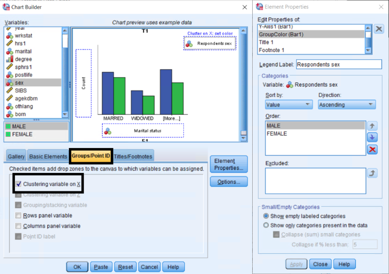
Once you’re finished adding elements and editing the features of the chart, click OK to create the chart. Once you’re finished adding elements and editing the features of the chart, click OK to create the chart.
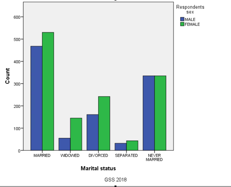
Editing a Chart
The Chart Editor can be opened in two ways: (1) Double-clicking on the chart or (2) right-clicking the chart and selecting Edit Content > In Separate Window.
Adding Data Values
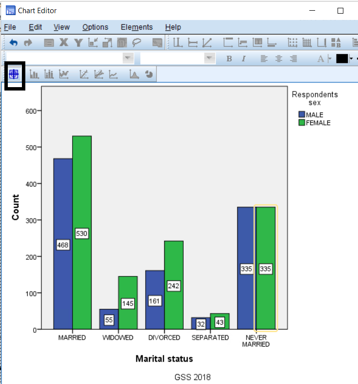
Click the  Data Label icon in the Toolbar, and click once on the bar to which you want to add the data value. To delete the data value you added, bring the cursor onto the bar again, and click once. Once finished, exit the Chart Editor window, and your changes will appear in the Output Viewer.
Pie Chart
A pie chart is a graphic representation of a categorical variable, which uses a slice in a circle (or a pie) to show the frequency or proportion of each category in the categorical variable. It is typically used to compare proportions.
For example, a pie chart may be used to illustrate the proportional distribution of marital status.
- In the Menu bar, select Graphs > Chart Builder.
- In the Chart Builder, click the Gallery tab and select Pie/Polar from list.
- Drag the Pie Chart icon onto the canvas.
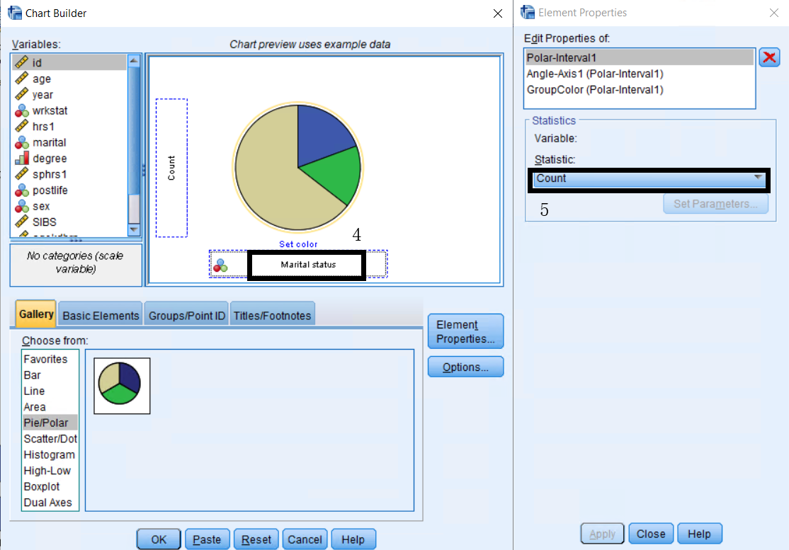
- Drag the variable marital to the Slice By drop zone. The number of categories in the variable determines the number of slices in the pie chart.
- Specify Count as the statistic in the Element Properties window. This statistic will determine the width of the slices.
- To add a title to the chart, click on the Titles/Footnotes tab, select one or more titles and footnotes and use the Element Properties window to edit the title/footnote text.
- Select Title 1, type “Marital Status” into the Content box in the Element Properties window, and click Apply.
- Select Footnote 1, type “GSS 2018”, and click Apply.
To add a grouping variable, for example sex, select the Groups/Point ID tab, select Rows panel variable, and drag the variable sex into the Panel drop zone on the canvas.
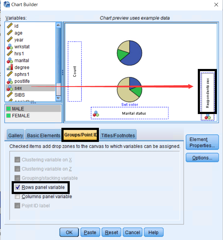
Once finished adding elements and editing the features of the chart, click OK to create the chart.
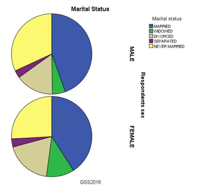
To create a pie chart using percentages based on the grand total:
- Open the Element Properties dialog box and select Percentage () as the Statistic.
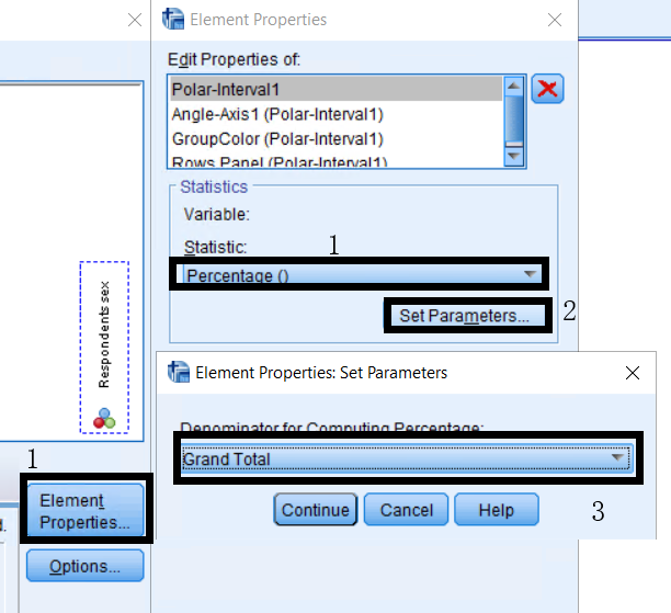
- Next, click on Set Parameters and select Grand Total.
- Click Continue and Apply before editing other features of the chart in the Chart Builder.
- When finished editing the other features of the chart, click OK.
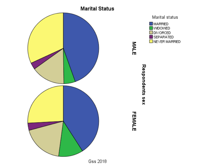
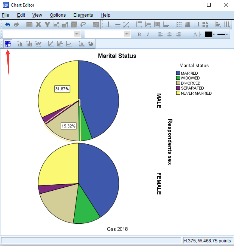
Now, in the Chart Editor, you can label the chart with percentages.
Double click on the graph to make the Chart Editor will appear. Then select Data Label Mode to label the graph. Once the Data Label Mode is active, you can click on the part of the graph for each respective group to add a percentage label. Select Apply and close the Editor.
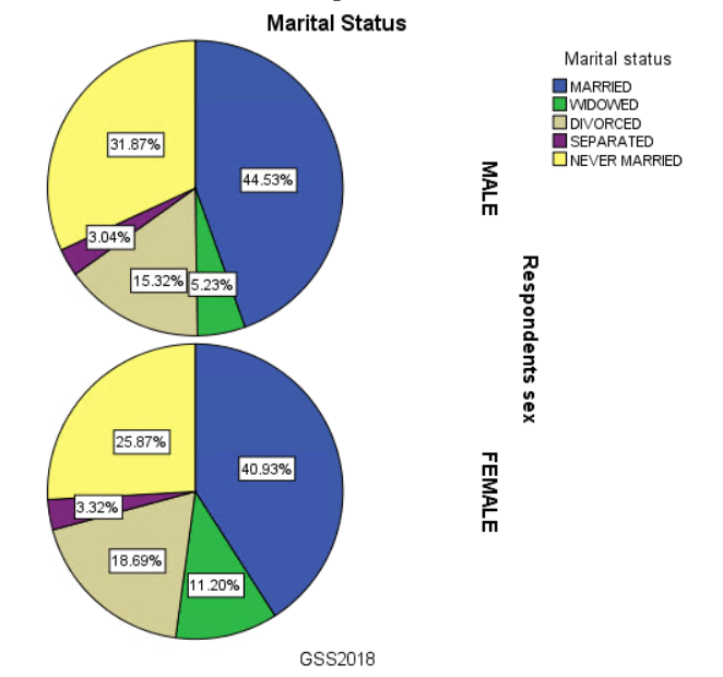
The final graph looks like the following after labeling all groups:
Exercise 5
Create a bar chart for the variable neisafe. This variable is based on the question, “How safe interviewer thinks neighborhood is?” The answers are categorized as: Very Safe, Somewhat Safe, Somewhat Unsafe, Very Unsafe.
- Include the title “Interviewer’s Perception for Neighborhood Safety” and footnote “GSS 2018”.
- Display the data labels for each bar (in percent). What is the percentage for “Very Safe”?
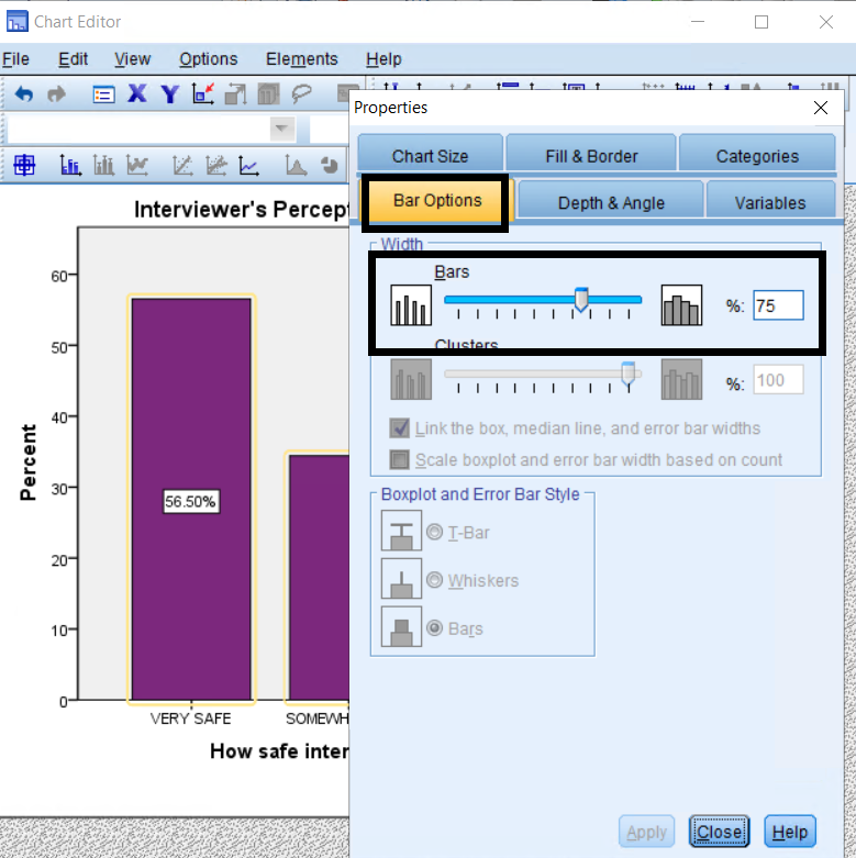
- Can you change the fill color of bars and the width between bars?
(See Appendix A for answers.)
Saving and Printing
Saving your data and output
In the Menu bar, select File > Save or Save as.
When saving SPSS files:
- SPSS generates two separate files: .sav for data and* .spv for output. Thus, make sure to save both the data and output files before quitting the program.
- Word (.doc), Excel (.xls), PowerPoint (.ppt), Text (.txt), and HTML (.html) can also be used to save output results.
To export selected output, there are two options:
- Copy and Paste the desired tables into a document.
- Right-click on the selected table(s) and select Export. In the Export Output dialog box, click Selected.
To export all output into another program:
- Right-click on the output file and select Export.
- Click on the Browse button to specify the location where the file should be saved.
- Under Export Format, select the file type (HTML, Text, Excel, Powerpoint, or Word), and click on OK.
Charts cannot be exported to Text or Excel files. Thus, when exporting chart output, use HTML, Powerpoint or Word.
Printing
To print:
- Activate the window that you want to print. If the Data Viewer window is open on top of the Output window, SPSS will assume that you want to print out the Data Viewer window.
- In the Menu bar, select File > Print.
- There are several options available in the Print dialog box.
- The default setting is to print All visible output, which will print all output currently visible in the output viewer.
- To print only selected items in the Output viewer, use the print Selected output option, and select the portions of the output that you want to print.
To print only one table or chart:
- Click once on the item in the Output viewer, and select File > Print.
- Under Print Range, choose Selected output, and click OK to print.
You may also print a selection of more than one tables or charts, by highlight the objects in the outline of output while pressing the Control key on the keyboard. Once the objects have been highlighted, proceed with printing.
Exiting SPSS
Remember to save the data and output files before exiting the program. When you are ready to exit SPSS, select File > Exit in the Menu bar.
Appendix A: Answers for exercises
Exercise 1
- In the Menu bar, select Analyze > Descriptive Statistics > Frequencies.
- Move sibs to the Variable(s) box by double-clicking it or by using the arrow.
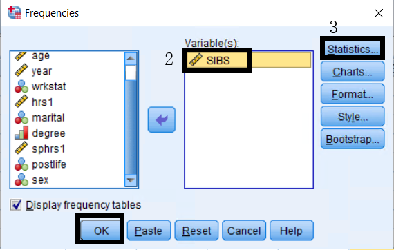
- Click on the Statistics button, and select the statistics Mean, Median, Mode, Range, and Standard Deviation.
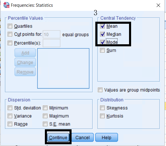
- Click Continue and OK to finish.
Results:
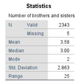
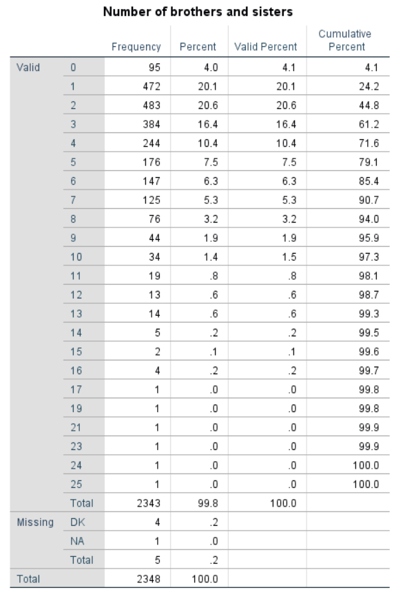
- There are 2348 total cases.
- There are 2343 valid cases and 5 missing cases.
- The mean is 3.58, the median is 3.00, the mode is 2, the range is 25, and the standard deviation is 2.863.
Exercise 2
- In the Menu bar, select Transform > Compute Variable.
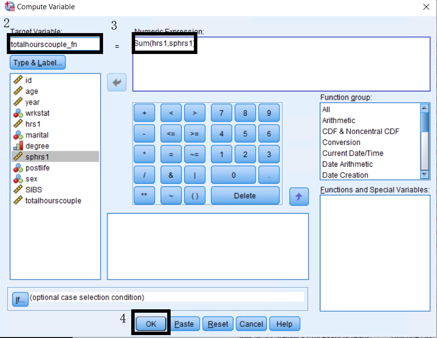
- Enter totalHourscouple_fn as the name for the new variable.
- Type
Sum(hrs1, sphrs1)into the Numeric Expression box or double-clickSum(?,?)from the functions list and replace the?with the variables. - Click OK to compute the variable.
- In the Menu bar, select Transform > Recode into Different Variables.
- Move hrs1 into the Numeric Variable box, and enter hrsRecode as the name for the Output Variable. You may also add “Respondent hours recoded” as the variable label.
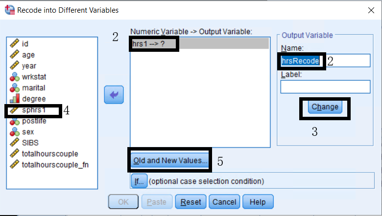
- Click the Change button after you have entered the name and label.
- Repeat for sphrs1, using sphrsRecode as the new variable name and “Spouse hours recoded” as the variable label.
- To specify the new values:
- Click the Old and New Values button.
- Select System- or user-missing for the Old Value with a New Value of 0, and click Add.
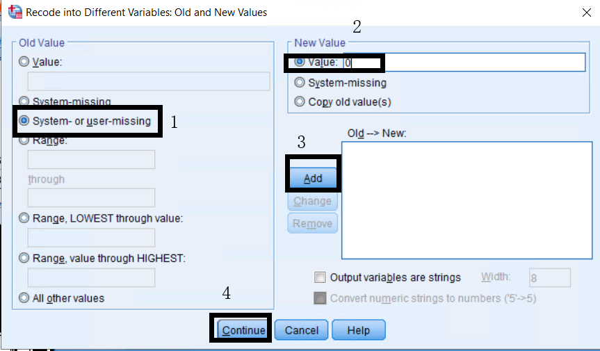
- Select all other values for the Old Value, specify Copy old value(s) for the New Value, and click Add.
- Click Continue, then OK.
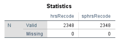
Use the Frequencies procedure to check that there are no missing values for hrsRecode and sphrsRecode so that all cases will be included when computing the new variable.
- In the Menu bar, select Transform > Compute Variable.
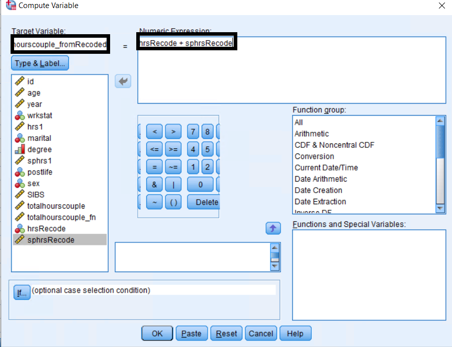
- Enter totalHourscouple_fromRecoded as the name for the new variable.
- Enter
hrsRecode + sphrsRecodeinto the Numeric Expression box. - Click OK to compute the new variable.
Use the Frequencies procedure to see the distribution of the new variable totalHourscouple_fromRecoded.
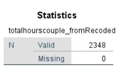
Recall from the exercise performed in class, there are 452 valid cases and 1,896 missing cases for the variable totalHourscouple which was computed using an arithmetic operator (hrs1 + sphrs1). As such, SPSS ignored any cases with missing values in any of the operand variables.
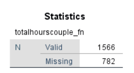
The new variable totalHourscouple_fn, computed with the Sum function (Sum(hrs1, sphrs1)), has 782 missing cases, which means that there are 782 cases with missing values for both variables.
The new variable totalHourscouple_fromRecoded has 2,348 valid cases and 0 missing cases because you recoded all missing values for both variables into 0. Thus, it does not make any difference whether you use an arithmetic operator (i.e., +) or sum function.
Exercise 3
- In the Menu bar, select Transform > Visual Binning.
- Move agekdbrn to the Variables to Bin list, and click Continue.
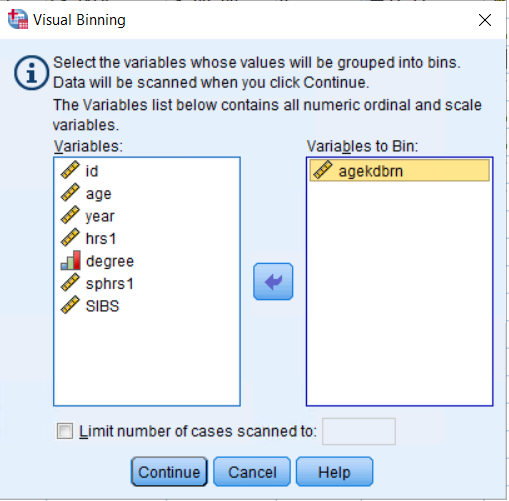
- Click on the variable agekdbrn in the Scanned Variable List box. You will now see a bar graph for this variable.
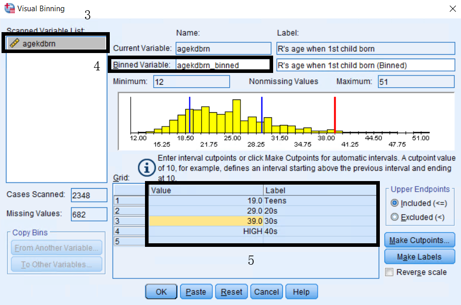
- Type agekdbrn_binned as the name for the new variable in the Binned Variable box and edit the variable label if needed.
- Manually enter the following into the Value and Label columns of the Grid:
| Value | Label |
|---|---|
| 19 | Teens |
| 29 | 20s |
| 39 | 30s |
| High | 40s |
Note: You will get the same results if you select Make Cutpoints and enter 19 as the first cutpoint location with 3 as the number of cutpoints. 6. Click OK to finish.
Generate a frequency table to confirm that the new variable was created:
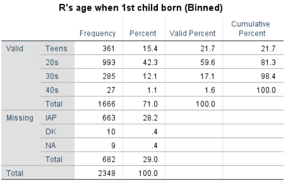
Exercise 4
- In the Menu bar, select Analyze > Descriptive Statistics > Crosstabs.
- Move the dependent variable othlang into Row(s).
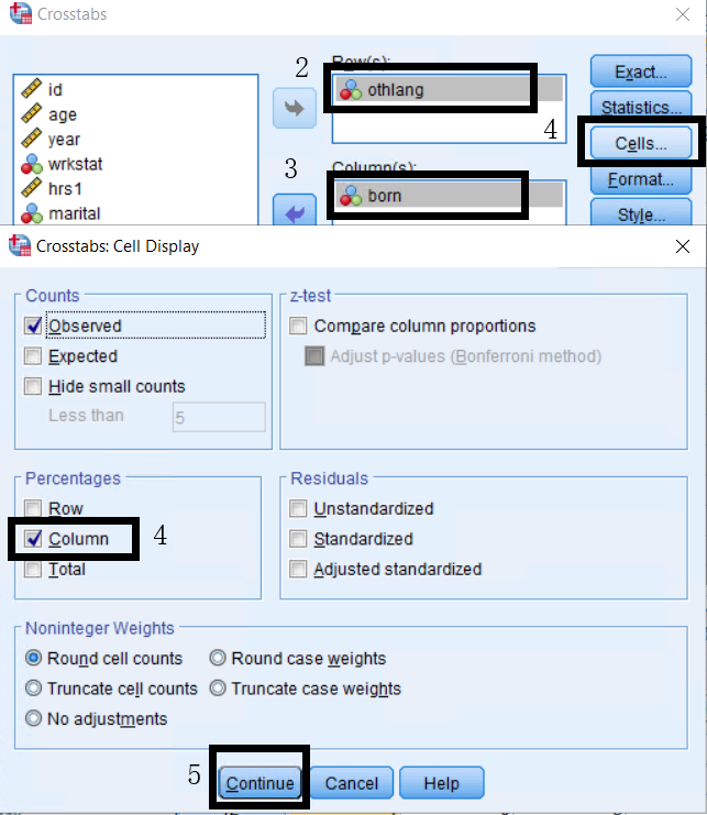
- Move the independent variable born into Column(s).
- Click on Cells and select Column for percentages.
- Click on Continue and OK.
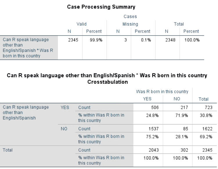
Interpretation of the Crosstab:
- Number of valid cases: 2,345 cases are included in the crosstabs table
- Number of missing cases: 3 cases do not have a valid value for at least one of the variables
- 24.8.
- Combining native- and foreign-born, 30.8.
Exercise 5
- In the Menu bar, select Graphs > Chart Builder.
- In the Chart Builder, click the Gallery tab, and select Bar from the list.
- Drag the Simple Bar icon onto the canvas and the variable neisafe to the x-axis drop zone.
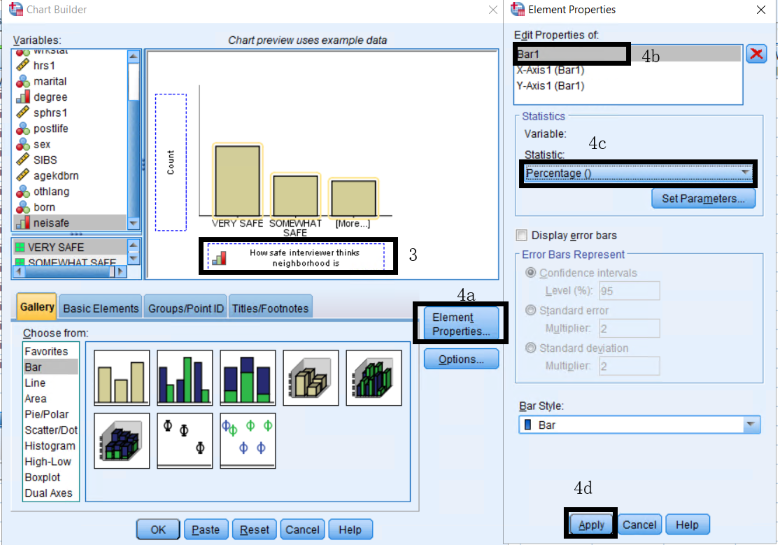
- Click Element Properties, select Bar1, specify Percentage () as the statistic, and click Apply.
- To add a title and footnote:
- In the Chart Builder dialog box, click the Titles/Footnotes tab, and select Title 1.
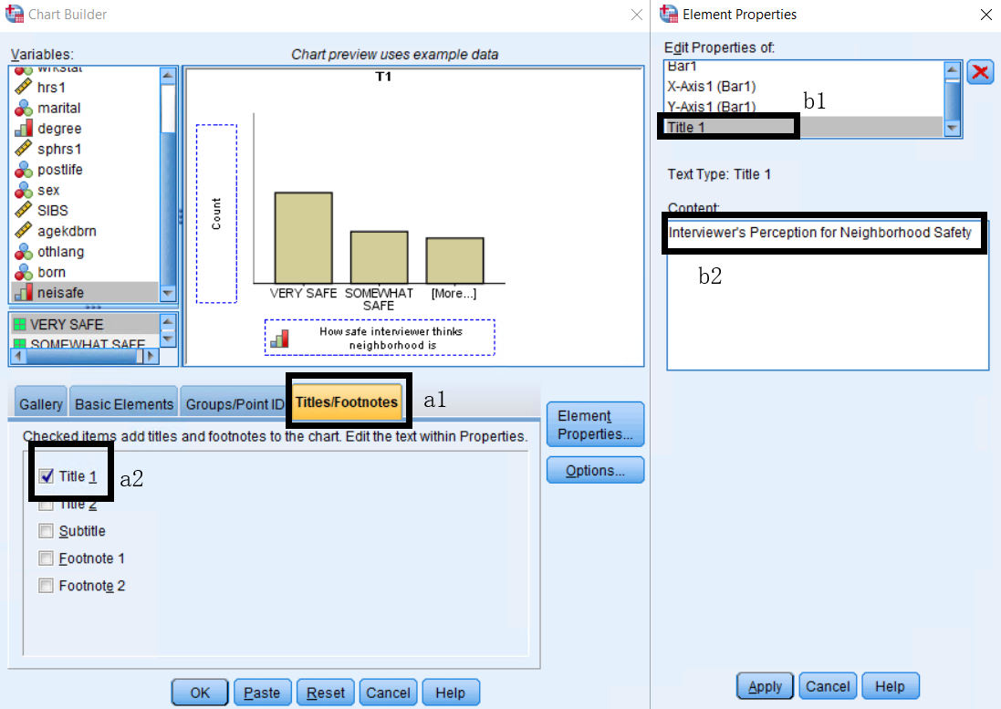
- In Element Properties, select Title 1, type “Belief that English Unites All Americans”, and click Apply.
- In the Chart Builder dialog box, and select Footnote 1.
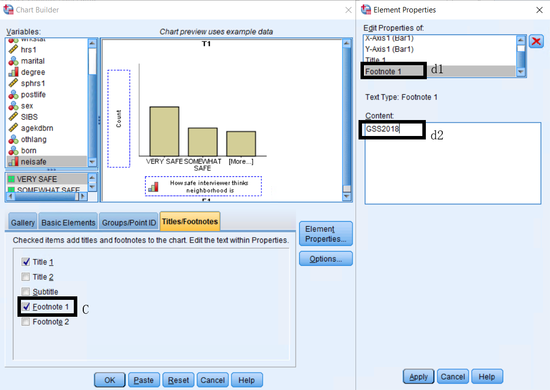
- In Element Properties, select Footnote 1, type “GSS 2018”, and click Apply.
Once finished adding elements and editing the features of the chart, click OK to create the chart.
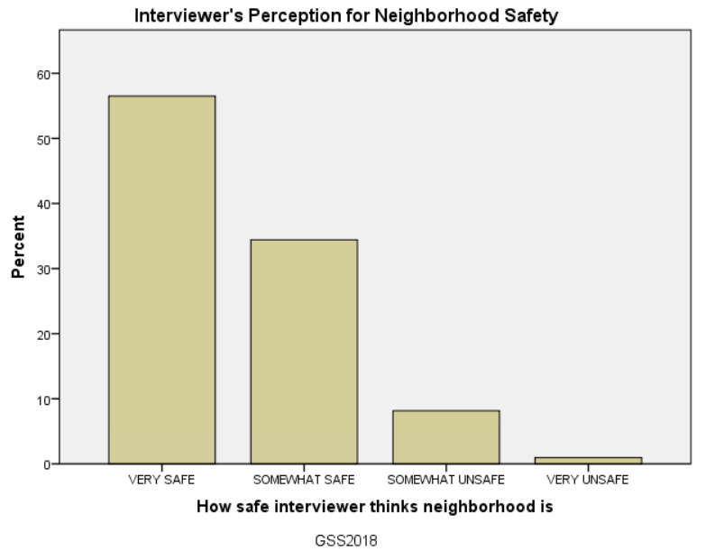
Open the Chart Editor by double-clicking on the chart or right-clicking the chart and selecting Edit Content > In Separate Window. Add data values by clicking the Data Labels Mode icon in the Toolbar or selecting Elements > Data Labels Mode in the Menu bar. Click on the bar to add the data value.
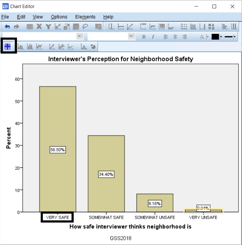
When done editing, exit the window.
From the output, you can see that 56.50
To change the color and width of the bars:
- In the Chart Editor, double-click any bar. This will open a Properties dialog box.
- Select the Fill & Border tab, and click on the color box next to Fill.
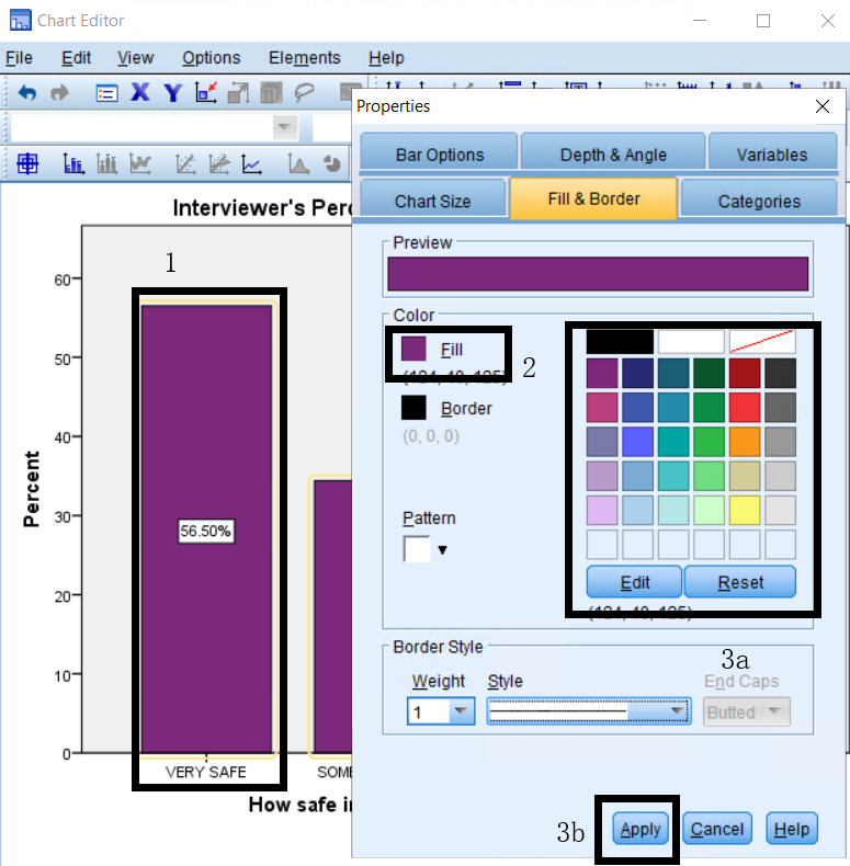
- Choose your desired color, and click Apply.
- Select the Bar Options tab, move the Bars slider to the desired width, and click Apply.